
The Deli Dilemma: Perspective on Menu Accessibility and Customer Experience
Inside Northeastern University lies Wollaston's Market, a deli that serves as a microcosm of student life and diversity. My tenure as a deli staff member for the past six months has granted me a front-row seat to the intricate dynamics between a menu's design and the customer experience it shapes.
A Tale of Text and Trials
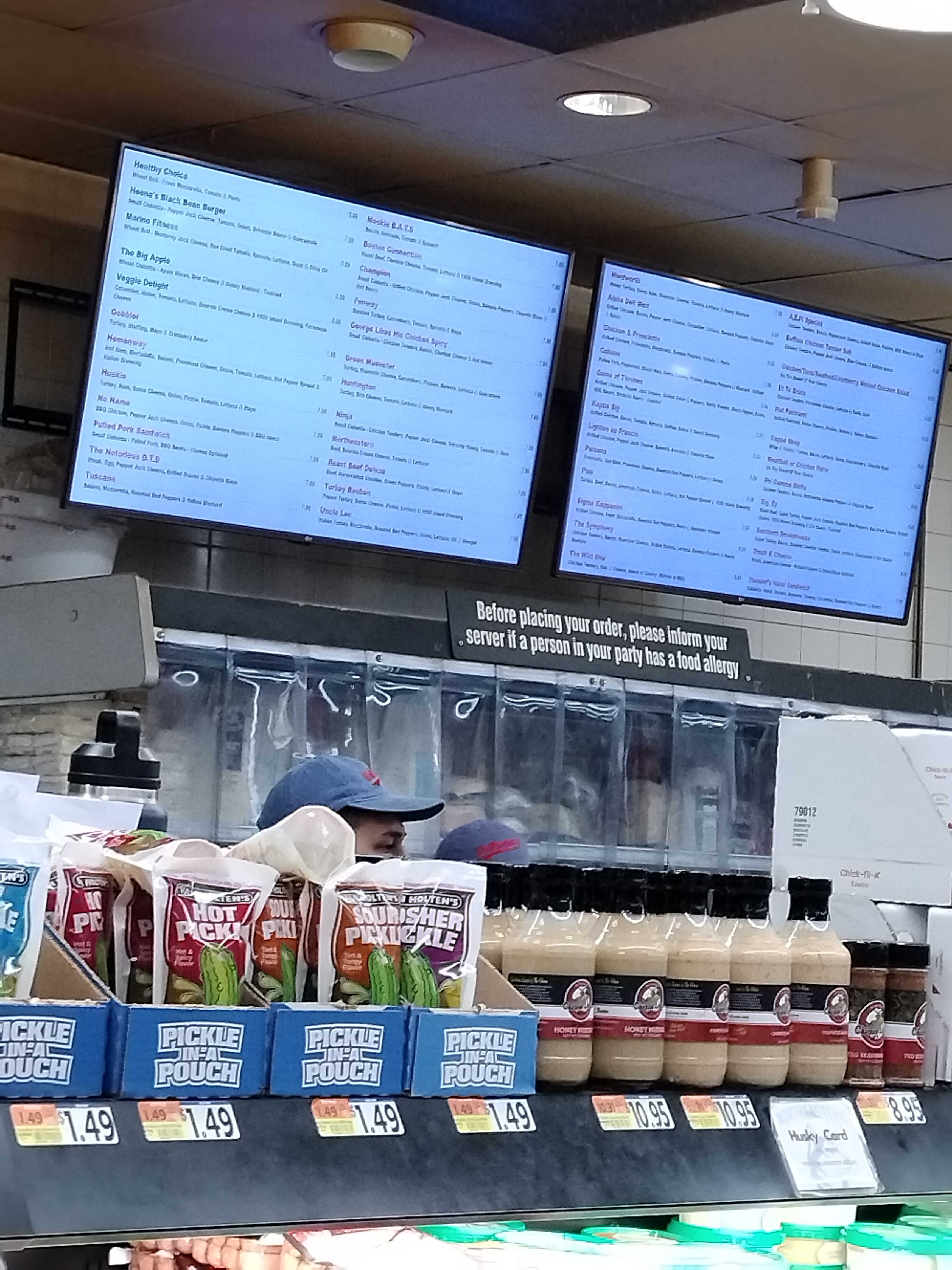
Gazing out from my position behind the counter, it's become routine to see patrons squinting at the digital menu that stands behind us. It's not uncommon to see the text proving challenging for those with glasses or more mature eyes—a digital divide that necessitates the alternative of a paper menu for better accessibility.
The Quest for Greens
The menu’s options for vegetarian or meat-free sandwiches often get lost in translation, leading to a default choice: the 'Veggie Delight.' Amidst the grill's sizzle, a recurring question arises from our patrons: "What else is vegetarian here?" It's a signal that the vegetarian options, though present, are lost in a menu.
The Rush Hour Riddle
During the deli's peak hours, the decision-making process slows, and queues lengthen as customers navigate the menu.
A Sandwich on a Budget
The wallet’s weight is a universal consideration—students especially seek out offerings that promise a reprieve to their budget. They scan the menu with a discerning eye, searching for that sweet spot where cost and craving meet.
Towards a Solution
These observations pivot towards a crucial inquiry: How can I synthesize these insights into a menu design that speaks to the varied needs of Northeastern's students and staff? My aim is to leverage UI/UX design principles to create a menu that is legible, efficient, and sensitive to dietary and fiscal preferences.
Moving forward, I seek to marry functionality with inclusivity, transforming the menu into a tool that not just lists options but facilitates a positive, seamless customer experience.
Surveying for Customer Insight
I prepared a set of questions. My goal was not merely to confirm my observations but to unearth the depth of our customers' needs and preferences. With each sandwich crafted and wrapped, a new piece of the puzzle was shared by the one who would savor it.
- How would you rate the ease of navigating our digital menu today?
- Was the text on our digital menu clear and easy to read?
- How quickly were you able to decide what to order from the menu?
- Did you find our menu's layout to be intuitive and organized?
- Were the descriptions of our sandwiches helpful in making your decision?
- Can you tell me about any challenges or frustrations you experienced while looking at the menu?
- If you have specific dietary preferences, was it easy to find suitable options on our menu?
- Do you have any suggestions on how I could improve our menu to serve you better?
As my survey unfolded, the feedback gathered began to sketch a vivid portrait of customer experience. While some findings echoed my initial observations, others unveiled new layers of our patrons' needs. Here are some of the shared sentiments:
-
Navigational Challenges: Patrons expressed a common frustration: "Finding what I want can be a real scavenger hunt. The menu keeps shifting between screens, and items aren't where I last saw them. It'd help if each menu item had a fixed spot."
-
Clarity in Dietary Options: The plight of non-meat eaters was highlighted, with responses like "I'm vegetarian, and it's a hassle to hunt down the non-meat choices. Sometimes I end up just picking the same thing because it's too hard to distinguish the vegetarian options from the rest."
-
Bread Variety Confusion: Customers voiced surprise over the bread choice, suggesting "Maybe include bread types in the item names or descriptions? I was surprised when my sandwich came on a ciabatta; I expected the usual sub bread."
-
Meat Preference Specificity: Meat lovers yearned for clarity, noting, "I specifically look for chicken sandwiches, so I read the descriptions closely. It would be great if the menu highlighted the main protein so I could spot my favorites faster."
-
Price Visibility: Several responses centered around financial concerns: "I'm always on a budget, so I want to see prices at a glance. Sometimes, it takes me a while to locate the price on the screen."
-
Speed of Selection: During peak periods, the pressure mounts, as one customer remarked, "During busy times, I feel rushed to choose because I don’t want to hold up the line. A more streamlined menu might speed things up."
These generalized answers not only aligned with my own observations but also added depth to my understanding of the customer experience at Wollaston's Market.
Implementing UI/UX Principles
After gathering customer feedback and understanding the crucial aspects that needed improvement, I embarked on redesigning the menu with a focus on usability and accessibility. Here's how I applied various UI/UX principles to the new menu design:
Embracing Hick's Law
I've grouped sandwiches by price in ascending order and sorted them alphabetically within each group to simplify the decision-making process. This method aligns with Hick's Law, suggesting that limiting choices can speed up and ease the selection process for my customers.
Law of Similarity and Color Theory
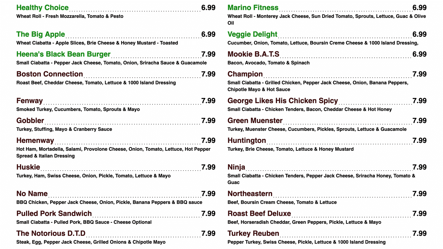
Utilizing the Gestalt principle of similarity, I've highlighted vegetarian options in green. This strategy aids customers in quickly spotting meat-free choices while incorporating color theory principles, where green signifies plant-based and freshness.
Enhancing Visual Hierarchy
I chose a bold font for sandwich names to establish a clear visual hierarchy. This allows patrons to swiftly identify their sandwich of choice and navigate the menu with greater ease.
In addition to these improvements, I made a deliberate choice regarding the background color and font used in the new menu design. The background was set to #FEFEFE instead of a stark #FFFFFF. This decision was made considering the display technology—a LED TV—which has a tendency to overemphasize bright colors, making pure white backgrounds potentially glaring and harder on the eyes. The slightly off-white #FeFeFe offers a softer visual experience, reducing eye strain for customers.
The font selected for the menu is LATO, known for its readability and modern aesthetic. LATO balances well between being highly legible for all ages and adding a contemporary look to the menu, aligning with the deli's forward-thinking brand identity. This choice underscores the importance of readability and aesthetics in enhancing user experience, ensuring that the menu is not only easy to read but also visually appealing.
Applying the Law of Proximity
In the revamped menu, I've placed items within the same price category in closer proximity to each other. This arrangement indicates a relationship between the items based on price, embracing the Law of Proximity.
Improving Accessibility
To better serve customers with visual impairments, the blue background was removed to amplify the contrast. This improvement makes the text stand out more, ensuring readability from various distances.
Focusing on Consistency
I've adopted a uniform approach to describing menu items: starting with the type of bread, followed by the main ingredient, cheese, vegetables, and dressings. This consistent pattern reduces the cognitive load for customers as they scan through the menu options.
The new design remains on a single screen without shifting, addressing navigational challenges. Also, by improving the layout to follow an “F Pattern,” we align with natural reading patterns, from left to right, and then top to bottom, enhancing the speed of selection during rush hours.
Menu Management: From Complexity to Simplicity
After addressing the immediate needs of our customers through a thoughtful redesign of the menu, the next phase focused on the backend—specifically, the process by which the deli team updates and deploys this menu. The original system, based on a MERN stack, was a complex beast. It required a server to be running in the background and any changes to the UI necessitated a series of convoluted steps. For a team primarily composed of individuals without a deep technical background, this setup was far from ideal. It was clear that a more user-friendly approach was needed to ensure that our menu could evolve alongside our patrons' tastes and preferences without the burden of technical overhead.
The Technical Redesign
The solution came in the form of a Python script, designed to democratize the process of menu updates. This script, leveraging the simplicity and power of Python along with libraries like Pandas for data manipulation and BeautifulSoup for HTML template modification, provided a streamlined pathway from menu update to deployment.
File Structure Comparison
A visual representation can illustrate the contrast between the previous MERN stack implementation and the current Python-based solution. Here's a comparative view:
MERN Stack Complexity
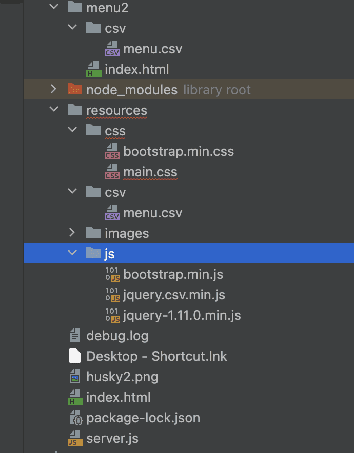
The MERN stack required multiple nested directories, separate CSV files for different menus, and depended on a constantly running server for menu display. The intricacy is evident in the folder hierarchy and necessitates detailed technical knowledge for any update or maintenance.
Streamlined Python Approach
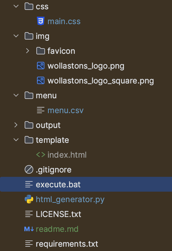
In stark contrast, the Python-based approach consolidates the menu data into a single CSV file within a 'menu' directory. The absence of a complex folder structure signifies a simplified process, whereby a single batch file execution updates the entire menu.
The Departure from MERN
While the MERN stack solution offered robustness and scalability, it was an overengineered solution for the needs. The requirement to keep a server running just to display a menu was not only resource-intensive but also introduced unnecessary complexity for staff. The pivot to a more straightforward, serverless approach meant we could sidestep these issues, making menu management accessible to all staff members regardless of their technical know-how.
The Process Unpacked
- Data Input and Organization: At the heart of my new system is a CSV file—a simple, editable format familiar to anyone who has used spreadsheet software. This file contains all the menu items, their descriptions, prices, and other relevant details. When updates are needed, be it a new sandwich or a change in price, staff members directly edit this CSV, no complex coding required.
- Automated Sorting and HTML Creation: Upon updating the CSV file, the next step involves running the Python script. This script first sorts the menu items based on predefined criteria (dietary flags, price, etc.), ensuring the menu's logical organization. It then generates HTML files for each menu section by populating a base template with the sorted data. This automated process ensures consistency in presentation and adherence to our UI/UX principles.
- Simplified Deployment: The final step in the process is launching the menu. This is achieved through a batch file (
execute.bat), which, when double-clicked, runs the Python script. The script's execution updates the menu and automatically opens it in a web browser, ready to be viewed by staff and customers alike. This step remains constant whether or not the CSV file has been updated, ensuring a seamless experience for the user.
From a Non-Technical Perspective
For the staff, this new system transformed what was once a daunting task into a simple, two-step process. If the menu needs updating, they edit a single CSV file—a task as simple as updating a spreadsheet. Then, with a double click on the execute.bat file, the updated menu is automatically sorted, formatted, and displayed in a browser. This process doesn't just save time; it eliminates the fear of making mistakes.
Conclusion and Next Steps
Through this journey of transforming the deli menu at Northeastern University's Wollaston's Market, I've merged my background in software engineering and data science with the dynamic world of UI/UX design. This project has been a profound learning experience, showcasing how UI/UX principles can significantly elevate customer experience.
As an individual with a penchant for problem-solving and a deep appreciation for user-centric design, this endeavor has enriched my understanding of how technology and design intersect to improve everyday experiences. I have simplified the menu management process and made it more accessible for the staff, leveraging Python and its powerful libraries to streamline updates and deployment.
However, the journey towards perfection is ongoing. One potential area of improvement lies in better categorization and the inclusion of pictorial representations of top-selling items. This strategy could enhance the visual appeal of the menu and aid in decision-making, particularly for new customers. Balancing the comprehensive display of the menu with the limited space available presents a challenge that requires thoughtful consideration and innovative solutions.
For those interested in the technical details or considering implementing a similar solution, I have made the source code available on GitHub. I encourage you to explore, adapt, and contribute to the project.
Complete code is available on my Github repo 👇